Previously on Buffy
BBC Cult - Printer Friendly Version
Notes - By Dark Horse's Buffy editor, Scott Allie
Personal touch
The following pages contain preliminary art and designs for Ring of Fire from Ryan Sook. It's uncommon for an artist to put such a personal touch on a work-made-for-hire like this, especially when that artist is on the rise the way Ryan Sook is. Following his controversial work on Spike and Dru, Ryan started to get regular and insistent offers from various companies, but he chose this book, teaming with Doug Petrie and Dave Stewart, as his first big project.
The results have been a huge step forward in his art, placing him amongst the best of today's comics artists. It's a pleasure to present a behind-the-scenes look at this first masterpiece by one of the young masters of the comics form.
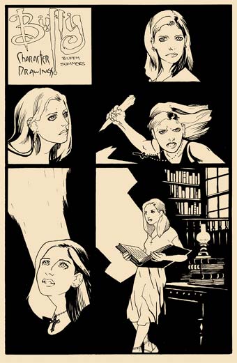
Buffy character drawings - one
Previously on Buffy
Doug and Ryan had teamed previously on the short story Bad Dog from the 1999 Buffy Annual, where Ryan used a style very similar to his Spike and Dru work. For Ring of Fire he wanted to develop a new look, to work better with Sarah Michelle Gellar's features, and the slightly more upbeat environment of Sunnydale and high school.
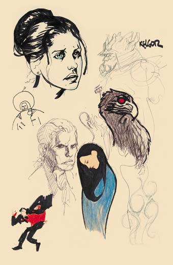
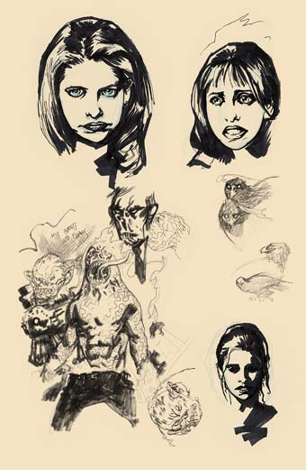
The following head shots of Buffy were part of that process. At the same time he was working on different looks for the demon Kelgor and the men in black, as well as goofing around with a Klimt version of Drusilla and a mosh-pit Spike. The purpose of the astronaut is unknown.
Buffy character drawings - two
Buffy character drawings - three
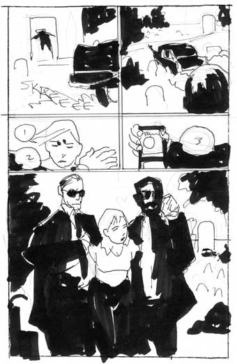
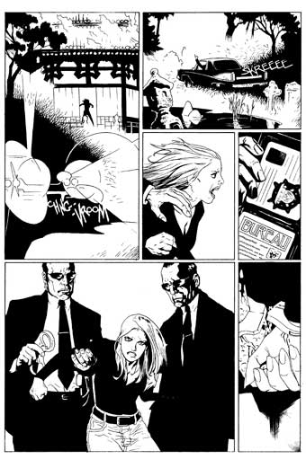
Planning page 10
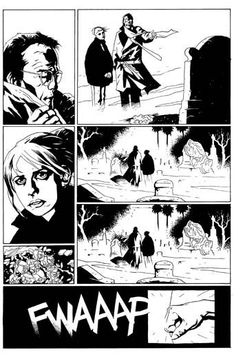
Before pencilling the pages, Ryan does fairly detailed thumbnails to show me how he plans to lay out the script. Though these look pretty sketchy compared to finished art, they are actually a lot more detailed than some artist's layouts.
For page ten, Ryan followed the script very closely in the layouts, with a pretty conventional treatment, including the transition to the next scene at the bottom. When it came to the final drawing, he added the panel of the roses lying on the ground, which became a motif throughout the comic. He also came up with a new take on the last panel - a design he used earlier in the first Spike and Dru comic.
Page 10 draft
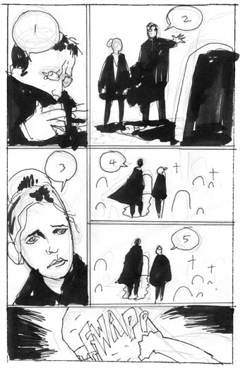
Page 10 final inks
Taking liberties
On the final two pages of the first chapter, similar liberties were taken with the script. Page twenty-two was originally written as a four-panel page. The second panel was described thus:
Buffy drops to the ground, exhausted, wrapping her hand in her coat. Still poised like an animal for flight, up on the tip-toes of her highpoint sneakers. The Ring of Fire is dimming behind her, the flames withdrawing back into the grooves in the ground. Behind the dimming flames, Willow, Xander and Oz stand huddled against a mossy wall.
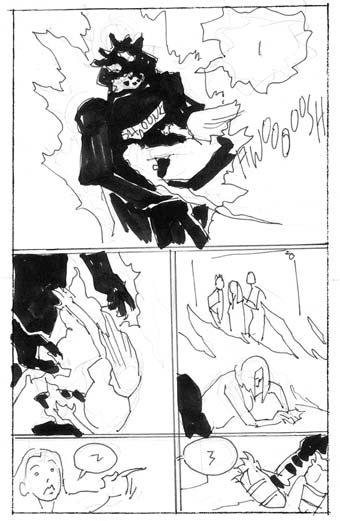
Page 22 draft
Page 22 final inks
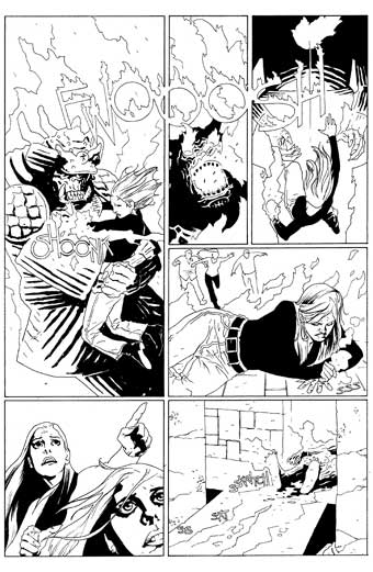
Smoothing the pace
This was expanded to two panels in the layouts, and then the closeup of Kelgor was added to smooth the pacing out even more. The design of the page went from being a very traditional stacking of panels to the more complicated arrangement. Ryan explained one of the reasons for this kind of design.
"Whenever I can, I like to have one vertical gutter going the length of the page. I know it sounds weird, but the line cutting the page in half pulls the readers' eyes from left to right in a more fluid way."
The sound effect bridges that vertical line, but doesn't actually interrupt it. Unlike most comics artists, Ryan draws almost all of his own sound effects.
Dramatic ending
On page twenty-three, Ryan took fewer liberties with the script, but what's interesting are the changes between the layouts and the finished art. Only one panel is added: the final panel, closing the chapter on the closeup of Buffy's cuffed hands - a more dramatic ending than the medium shot in the layouts.
Ryan gave the first panel more room, and directed the headlights towards us, giving a more dramatic chiaroscuro - clearly his speciality. Note how panels two through four are stacked in a more complex arrangement than in the roughs, but the compositions within the panels lead the eye through the layout, through the use of foregrounded elements and angles.
Page 23 draft
Page 23 final inks
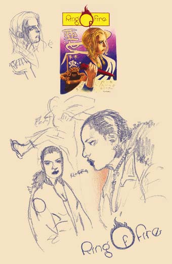
Cover story
Ryan did the small painting on the next page as another warm-up for the book, and Keith Wood adapted the title treatment for the final logo design. Ryan also did three chapter headings, which Dave Stewart used in the cover design. Doug and all the artist involved have given us a totally unique comic, as well as a great look back at the most dramatic period in the show's history.
Scott Allie
Cover and logo ideas